Do you use fundamental or technical analysis?
This is a question often asked of portfolio managers, analysts, traders and even individual investors. Some people use both methods, but most tend to favor one over the other. Instead of viewing these as two different paths of analysis, there exists a useful hybrid. Such a combination of chart analysis, applied to fundamental data, permits what may be a new perspective of the markets.
First a brief review. Fundamental analysis attempts to uncover the driving forces or reasons for either a current or future investment theme. Fundamental data may be based on actual results from corporate or economic releases such as sales numbers, employment statistics, new product launches, and countless other data series. Technical analysis attempts to study the results of investor actions, based on the concept that certain actions imply continuation or reversal in direction of the underlying investment or theme. Technical analysis based traders often employ tools such as moving averages, pattern analysis, and volume studies.
One could say that “cause and effect” are both assessed when incorporating fundamental AND technical analysis.
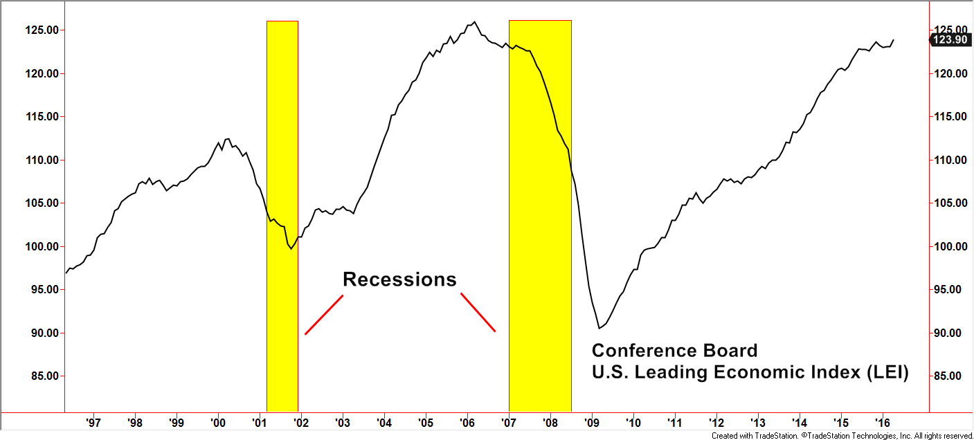
Now let’s break away from choosing one over the other or even side by side. Gathering data is the first step. The Conference Board publishes the U.S. Leading Economic Index (LEI). This is a composite list of mostly economic data, with a few non-economic ones in the mix. Examples of fundamental data include:
- Average weekly hours (manufacturing sector)
- Average weekly initial claims for unemployment insurance
- Manufacturers’ new orders for consumer goods and materials
- Institute of Supply Management’s Index of New Orders
- Manufacturers’ new orders, nondefense capital goods excluding aircraft orders
- Building permits, new private housing units
- Stock prices, the S&P 500 Index
- Leading Credit Index™
- Interest rate spread, 10-year Treasury bonds less federal funds
- Consumer sentiment
Even though the LEI is presented as one index line, the underlying data comes from a variety of categories that gauge economic activity and sentiment. Most of these, if studied separately, can be quite involved and require a very analytical skillset to arrive at a qualitative conclusion.
Created with TradeStation. © Tradestation Technologies, Inc. All rights reserved.
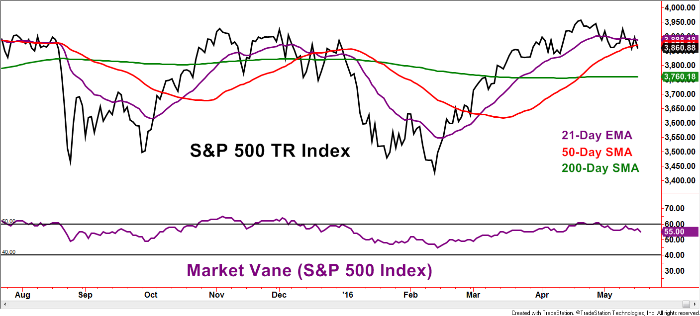
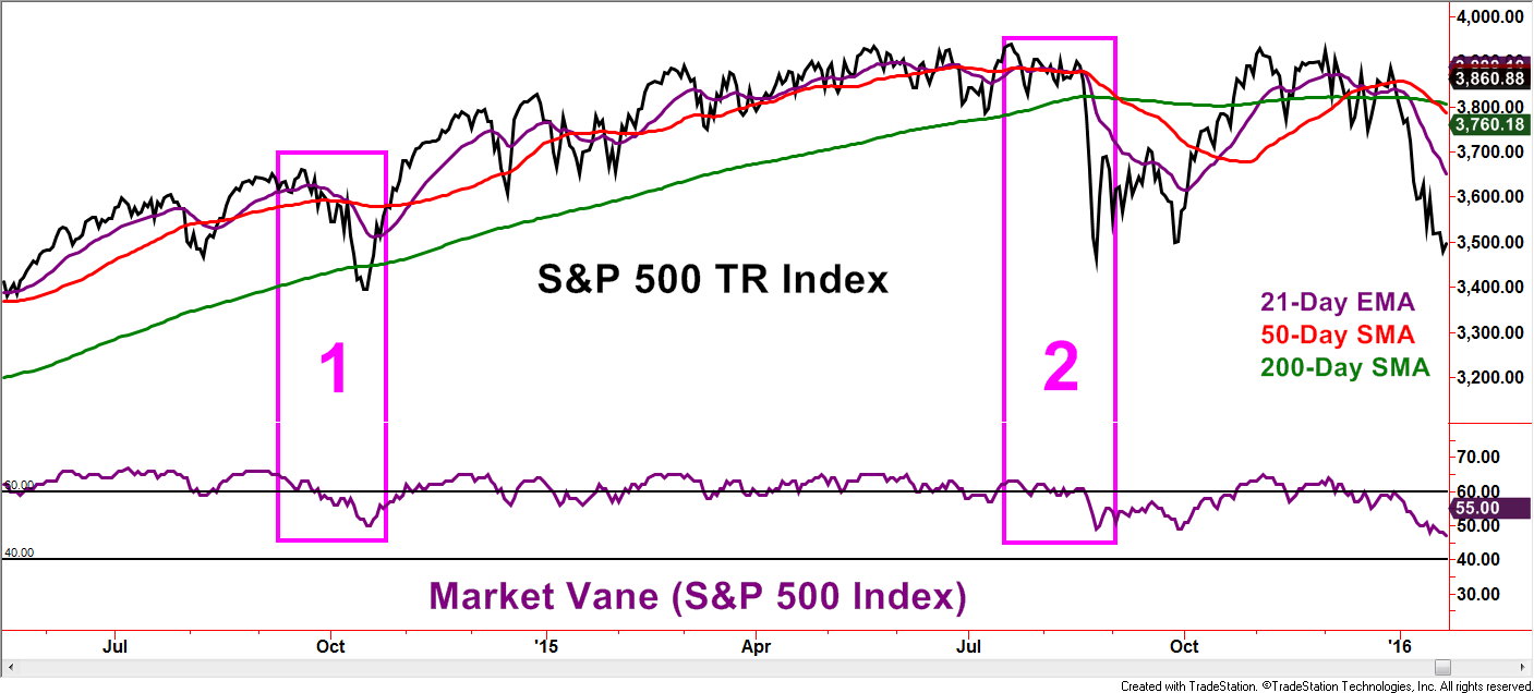
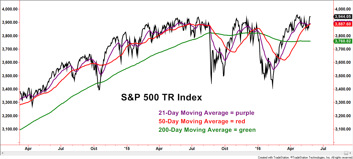
The chart below of the S&P 500 Total Return Index is shown with several popular moving averages. One common method used by technical chartists is to look for trend continuation after a stock or index breaks above or below a particular moving average. Those with shorter-term investment horizons tend to focus on moving averages of lower value settings while those with longer-term horizons use higher moving average setting values.
Created with TradeStation. © TradeStation Technologies, Inc. All rights reserved.
Another common method is to look for points in which the moving averages cross each other as a clue for continuation by the stock or index in the direction of the cross made by the shorter of the two moving averages. Investors assessing these methods often complain of whipsaws and late signals, especially in recent years. The point of the example is not to promote the validity, or lack thereof, of these two methods, but to note each methods existence and popularity.
The chart below displays moving averages applied on the fundamental data set of the LEI. Similar to the previous chart of the S&P 500 TR Index, positive, negative, and transitional trends are seen within the LEI and tend to become more visible with the aid of moving averages. LEI crosses above and below the moving averages, as well as the method that monitors moving average crosses of each other, both tend to have limited whipsaws (quick/false signals). Two data points are not statistically significant, but notice how the two methods issued warnings ahead of the recessions.
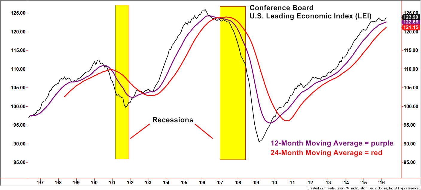 Created with TradeStation. © TradeStation Technologies, Inc. All rights reserved.
Over the last 20 years, the two most negative environments for the stock market, as measured by the S&P 500, were accompanied by recessions. The market peaks and troughs were not exact matches to the beginning and ending dated of the recessions. Notice, however, the positive and negative messages from the LEI if applying the two moving average methods when placed alongside the S&P 500 TR Index.
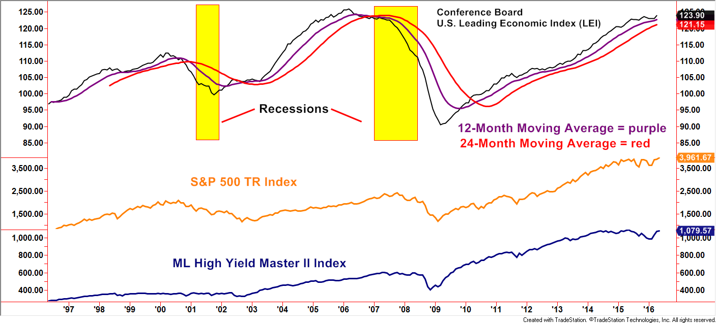 Created with TradeStation. © TradeStation Technologies, Inc. All rights reserved.
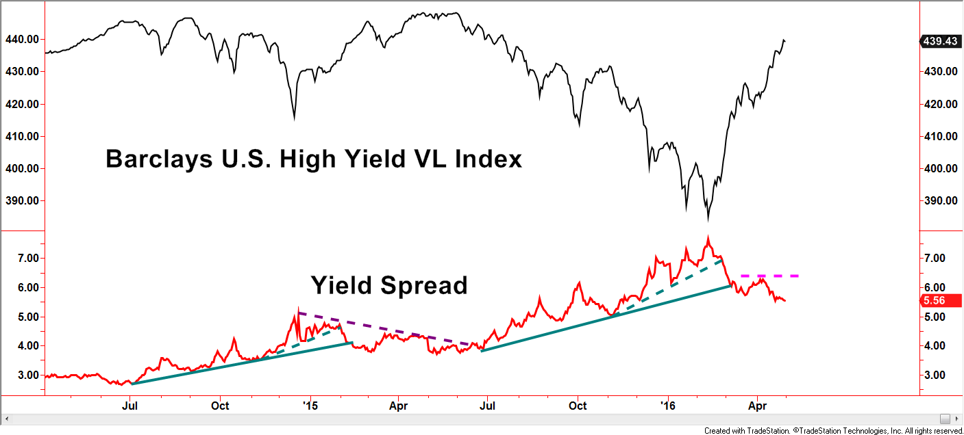
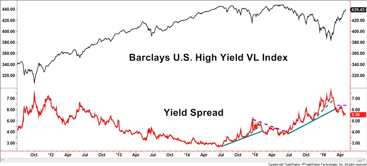
Fixed income investors generally believe recessions are the Achilles’ Heel of the high yield market. The BofA Merrill Lynch High Yield Master II Index, representing the high yield market, either struggled or declined in the two recessionary periods.
Applying technical analysis to the fundamental data would have given the user additional color in which to make decisions.
Another observation worth noting is during this 20-year period, when the LEI was in favorable trends (above the moving averages), corrections in the stock and high yield markets have been short-lived.
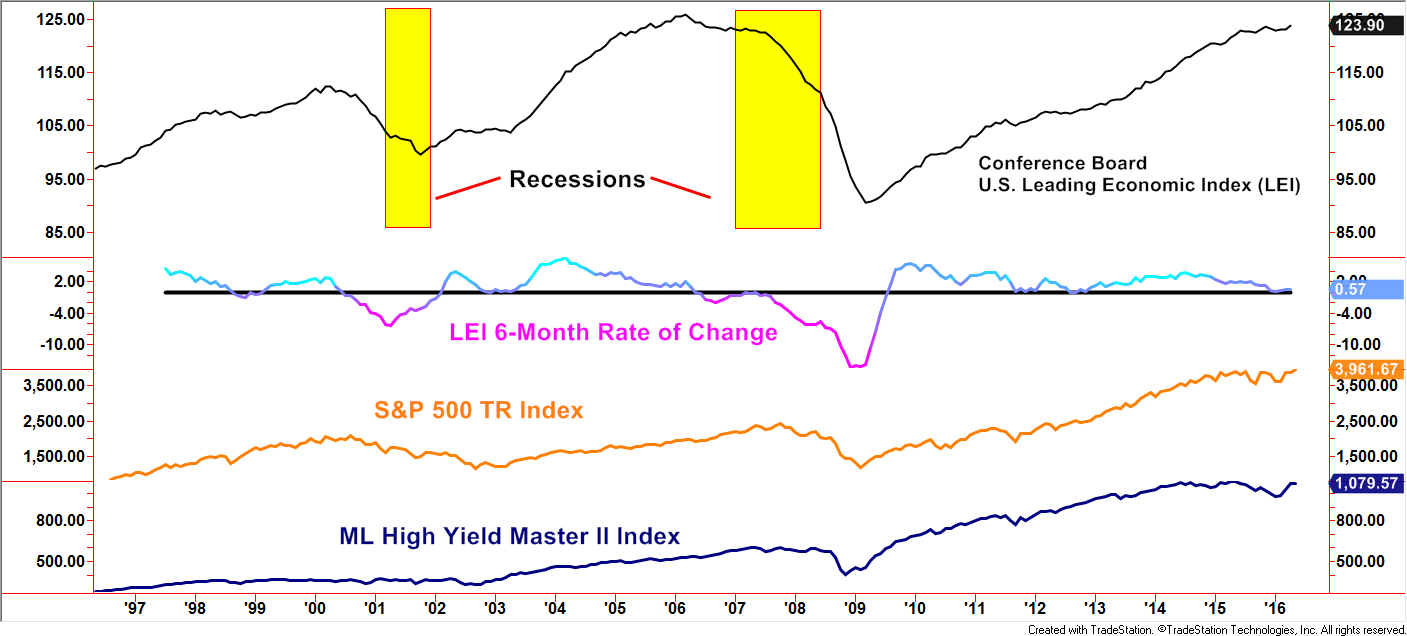
“Rate of Change” is another technical indicator that simply measures the percent difference over a period set by the user. The example above displays a 6-month Rate of Change indicator applied to the LEI data. Users of this methodology focus on above Zero (bullish) and below Zero (bearish) periods and the crossing points acting as signals.
 Created with TradeStation. © TradeStation Technologies, Inc. All rights reserved.
We covered only a few examples in order to introduce how technical analysis methodologies can be applied to fundamental data sets. A blend of fundamental data and technical analysis as compared to separating the two disciplines can open up new doors to paths of discovery when gauging the environments of the stock and bond markets.
Disclosures
S&P 500 TR Index: is a capitalization weighted index of 500 stocks representing all major domestic industry groups and assumes the reinvestment of dividends and capital gains. It is not possible to directly invest in any index.
BofA Merrill Lynch US High Yield Master II (H0A0):
The BofA Merrill Lynch US High Yield Index tracks the performance of US dollar denominated, below investment grade corporate debt, publicly issued in the US domestic market. Qualifying securities must have a below investment grade rating (based on an average of Moody’s, S&P and Fitch), at least 18 months to final maturity at the time of issuance, at least one year remaining term to final maturity as of the rebalancing date, a fixed coupon schedule and a minimum amount outstanding of $100 million. In addition, qualifying securities must have risk exposure to countries that are members of the FX-G10, Western Europe, or territories of the US and Western Europe.
This writing is for informational purposes only and does not constitute an offer to sell, a solicitation to buy, or a recommendation regarding any securities transaction, or as an offer to provide advisory or other services by Spectrum Financial, Inc. in any jurisdiction in which such offer, solicitation, purchase or sale would be unlawful under the securities laws of such jurisdiction. The information contained in this writing should not be construed as financial or investment advice on any subject matter. Spectrum Financial, Inc. expressly disclaims all liability in respect to actions taken based on any or all of the information on this writing. For full disclosure please see disclosures page here.