Author: Christopher P. Hendrix, CMT Page 1 of 11

A New Normal?

Sticky post

What is normal? 

It seems like the markets are always moving from one crisis to the next and trying to define the “new normal”.  Perhaps we can blame the media for promoting drama in attempts to attract viewers.  That may occasionally be true but no doubt that legitimate societal stresses are commonplace: wars, high profile corporate or even municipal bankruptcies, terrorist attacks, and natural disasters are just a few reoccurring events or conditions.  AND YET…markets have historically rallied back to eventually make new highs.

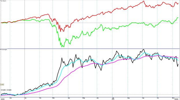
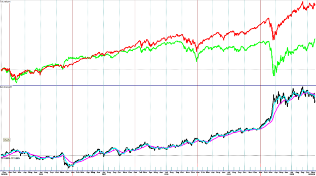
There are numerous examples on the internet of historical charts showing notable world events and the market’s reaction in price and duration. 

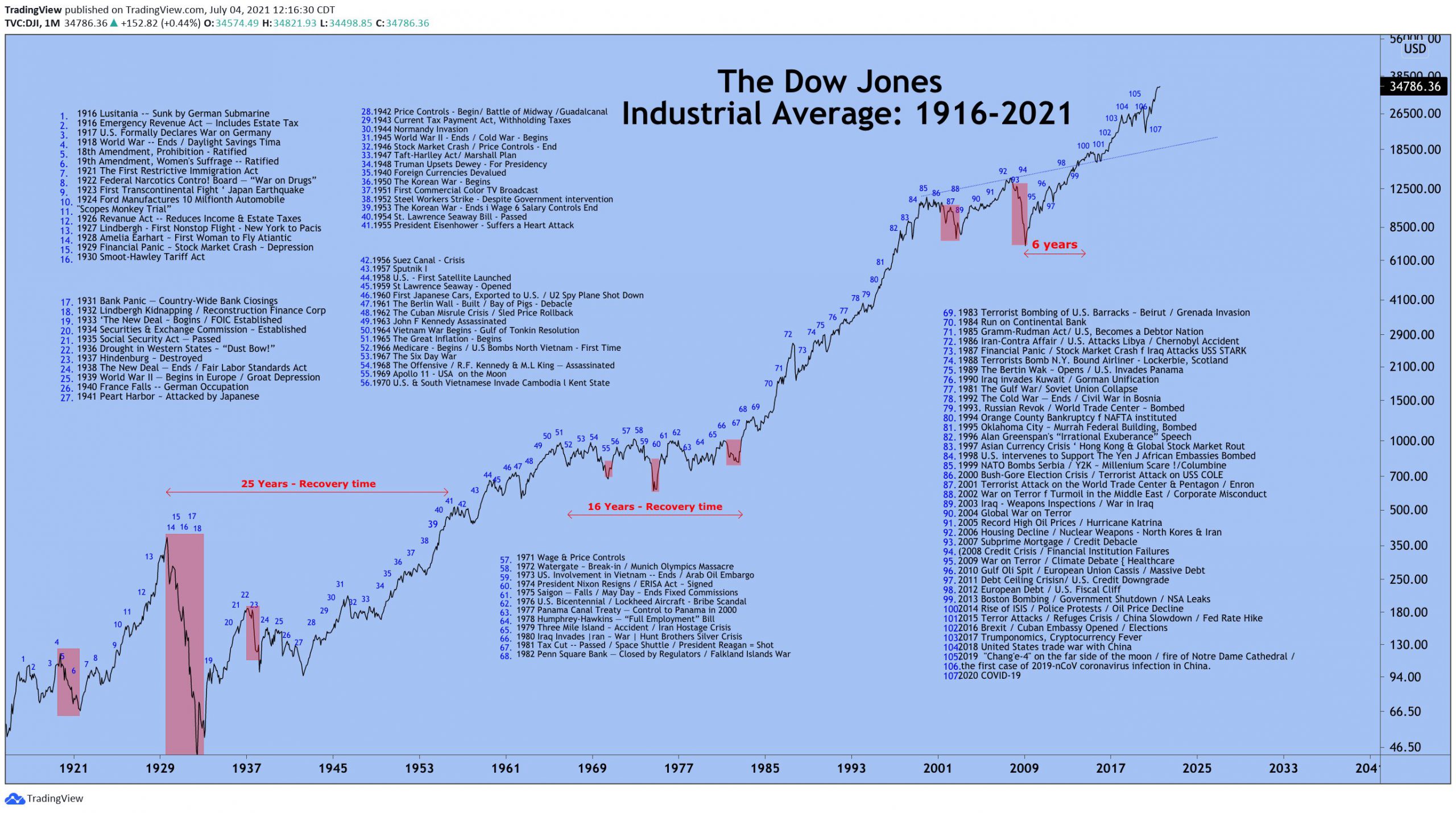
TradingView is the source of this chart, originally published 7/4/21 and is one of the more extensive compilations I have seen.

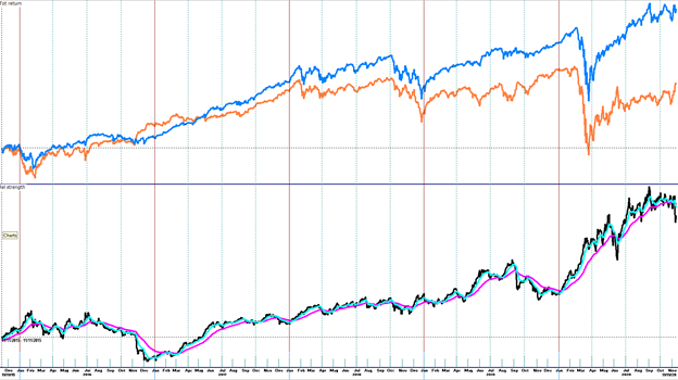
Updating for recent price action (but using the S&P 500 Index), note the significant influences to the recent decline in the chart below.

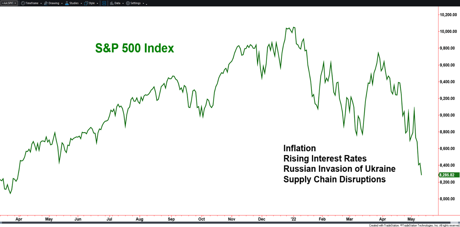
Created with TradeStation. © TradeStation Technologies, Inc. All rights reserved

The objective or bottom line of most articles, blogs, news stories, charts, etcetera that tie negative news to the stock market tends to be a message that investors should be calm and have hope, with a focus on a brighter future.  That advice has been correct for 100% of all pullbacks, corrections and bear markets since stocks began trading under the Buttonwood tree in lower Manhattan, and up through early January of this year.  That advice may be oversimplistic as the devil may be in the details.

The Fluidity of Indexes

Historical charts of indexes should be viewed with a grain of salt in that indexes periodically change components and weightings.  For example:

  • The Dow Jones Industrial Average has removed/added members 57 times since 1896.
  • The S&P 500 Index is rebalanced on a quarterly basis.

A committee establishes criteria and companies are added and subtracted.  This is a common practice for indexes.  Therefore, index charts most often are strung together performances of individual stock constituents held at that time.  The all-time highs made in early January by the S&P 500 Index and the Dow Jones Industrial Average were not set by the same stocks within the indexes during the bear market of 2008.  Investors that were holders in those particular stocks during the 2008 bear could have been given hope that the indexes should come back eventually.  Well – the indexes did but perhaps not with the down and out names held by some investors.  Is that idea a pitch for indexing, as in, should investors focus on just owning index investments?  No, not necessarily. There is a difference, however, between blind faith in a generalized market recovery in futures versus what companies may participate or be left out.

Let’s shift focus to why.

Again, through January of this year, all negative market periods over the last 100+ years have “recovered”.  This view is based on understanding and embracing the foundational economic principle that supports capitalism or at least market driven economies – profit motive.  Companies are often started by determined individuals, betting on themselves, looking to enrich their lives which often aligns with the betterment of other lives as well.  A lack of product demand and/or a lack of profit will eventually lead to a company’s failure.  In the context of this discussion, investors can choose to be a part of a company’s success or failure through stock ownership.  There is an individual and corporate drive to succeed in a free market system. 

Success is often determined on how a company responds to challenges and crisis.  New challenges come with each crisis.  New solutions are found and assumed to be rewarded.  At the onset of the pandemic, the equity markets fell sharply as questions were brought up regarding how the economy would be affected.  Generally speaking, the market then moved higher as answers came to light.  Again, some companies have not come back but many have and have done so transformed as evolved versions of themselves.        

Now that we have covered topics of optimism, warning, and back to optimism, let’s return to warning. 

The duration and depth of crisis have never been consistent.  Exhibiting faith in an eventual recovery is one thing, but it should not be blind faith as the pain of the crisis is endured.  Active management of investments, adjusting portfolios to changes in risk is not in opposition to the idea of market recovery.  The two can be symbiotic.    

As investors, we should not be expecting the market to settle into a “new normal”.  It will never come if defined as an extended period of a “lack of concerns”.  We must accept that “normal” is a constant pursuit of new innovations and ideas and we can participate by way of the markets while dodging and parrying the dangers.

At Spectrum Financial, we continue to pursue risk adjusted opportunities that the market presents and manage life altering risk for our clients. 

The New Relative Strength Trade

Sticky post

As active managers, we use many different price analysis tools to determine how to be attractively positioned. Relative strength, or comparative strength, is just one of the useful tools to help narrow down potential areas of investment. The concept is simple and attractive. From an equity perspective, find stocks that have a similar theme, detect outperformance versus another group or benchmark, then hold a belief the outperformance of the group can continue. In early 2020, as pandemic quarantines began to be seen as a new way of life, “COVID trades” became popular, consisting of companies benefiting from work from home, school from home, online shopping for essentials and non-essentials. Depending on the mix, some of those stocks posted returns well above typical benchmarks such as the S&P 500 Index. Since the election in November of 2020, other relative strength or theme trades have made headlines.

As mentioned, thematic trading can be very tempting to pursue, especially when promoted in the media. The purpose of this blog is to increase understanding in order to potentially guard against being overly influenced by outside sources. Let’s cover some of the how-to’s, pros, and then some cons or pitfalls of the concept, we will use 2020 as an example throughout this blog.

Theme investing and relative strength go hand in hand. Themes can be pre-made or custom. Mutual funds, exchange-traded funds (ETF’s), and indexes are examples of pre-made themes. Some may be broad-based such as small cap stocks. These can contain smaller companies across many sectors. A more narrow focus could be energy companies. This can be combined to get even more narrow if an investor wants small cap energy companies for example. Custom themes are often built by investors to fit certain scenarios, and are simply made up of inserting within one’s portfolio stocks that meet certain criteria versus buying a pre-made available investment. These nuanced ideas often make their way into the marketplace as packaged products by ETF providers, while others are intended to be just temporary such as the “COVID Trade” stocks.

Technology stocks have been favored for quite some time, including early on during the pandemic as technology played a major role in the work/learn/shop from home period. When progress and FDA approval of the vaccines and therapeutics were announced, this caused a sharp shift away from the stocks that ran up. New enthusiastic interest was shown toward those businesses that had been overly suppressed. Many of the companies hit hardest due to the pandemic were travel, entertainment, and restaurants. A broader brush stroke can point to smaller businesses and may include those noted sectors.

This trailing 12-month (November 2019-2020) chart displays the Invesco NASDAQ 100 ETF (QQQ) in red, consisting primarily of large cap technology stocks, and the iShares Russell 2000 Small-Cap ETF (IWM) in green. The black line is the result of the cumulative performance difference (percent basis) of the QQQ versus the IWM and is called a “Relative Strength” line, not to be confused with the popular indicator, Relative Strength Index. Comparative strength is a more descriptive but less popular term. A general rise or uptrend in the Relative Strength line means the technology heavy NASDAQ 100 had been outperforming while a general decline means small caps had been underperforming. A way to make it a little easier to define “general rise” or “general decline” is with the addition of the blue and magenta moving averages. The NASDAQ 100 would be considered the leader when the blue line is above the magenta and small caps have leadership when the magenta line is above the blue.

By now, I’m guessing you’re picking up on a common tendency of relative strength analysis. Outperformance is USUALLY not very consistent in the short-term. Strategies and techniques can produce attractive results but ultimately, the method needs to be implementable by the end user. Back to the chart above. Approximately 80% of the time or more, the NASDAQ’s trend, if defined by the moving average method, displayed leadership over small caps. However, every down move by the black relative strength line represents a day in which that leadership was not seen. That is an important and needed consideration in understanding this concept. Let’s take another step. First, this method shows the past with 20/20 hindsight. Of course, we cannot know the future, but we can go forward in time with a reasonable expectation. If a conclusion is derived that a particular group going forward may outperform the other, what should go through our minds? Remember, we had been presented by the media of the possible outperformance of certain groups because of the Biden victory in the presidential race as well as what stocks may do better than others as the economy opens up with the assumed eventual control or defeat of the pandemic. A few more examples before getting to our goal of becoming a bit more shrewd than when we started.

Same inputs as the previous chart, now look at the 5-year time frame (November 2015-November 2020) of the large cap, tech heavy NASDAQ 100 (QQQ) versus the small caps (IWM). In 2016, the relative strength line was trending lower, generally speaking, as small caps led. However, there were enough months in which the QQQ’s led that it would have been difficult to hold on to a stance or a portfolio biased to small caps. Stepping back and looking at the 5-years, large cap technology held leadership more than they didn’t. Expecting leadership by small caps under a Democrat led administration may fit logic, and currently fits the blue line versus the magenta line moving average method. HOWEVER, steadfastly embracing such a concept, especially believing there should be smooth consistency in outperformance by small caps is not very likely, not in line with historical tendency.

ETFs representing momentum (blue) versus value (orange) is another comparison currently being discussed in the media regarding stocks that performed well during the pandemic in light of a potential rebound in the beaten down stocks as the pandemic continually loosens its grip both domestically and internationally. There are certainly some characteristics similar to the previous chart. A major reason is likely because the momentum versus value story has a lot of overlap with the stocks from the previous chart – high momentum stocks have generally been technology, which includes some health care names searching for vaccines and therapeutics, hence the term bio-“technology”.

“Discipline is more important than conviction” is a motto I’ve used for many years. When hearing commentators on tv or the internet present their cases for what to own, especially predicting relative strength sector or thematic shifts, we need to not forget the devil in the details. Thematic shifts may have merit, but we need to be able to reconcile potential movements with our own investment style. What has been presented is simply a couple of techniques to help recognize thematic or relative strength tendencies for ourselves versus just taking the media’s word for it.

Page 1 of 11

Spectrum Financial, Inc 2023