Tag: Technical Analysis Page 1 of 3

A Beginner’s Guide to Buy Low, Sell High

A Beginners Guide to Buy Low, Sell High

 “Buy low, and sell high”, is foundational advice often given to beginning investors in order to avoid losses and lock in gains.  In an attempt to reach that goal, a portfolio manager often draws from the discipline of technical analysis which at its core, focuses on the effects of buying and selling pressures on assets such as stocks, bonds and commodities.  Technical analysis is often contrasted against fundamental analysis which focuses on gauging the financial health of a specific company or industry.  The two can also be blended, introducing an additional discipline, economic analysis.  This post will explore the technical analysis discipline which is diverse.  However, most technical analysis tools can be separated into either trend following or mean reversion categories. 

Understanding how markets move

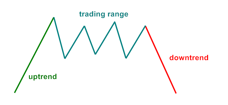
Markets have two states of movement, either trending up/down or rangebound. A portfolio manager must first use indicators specific to identifying the two states of movement. Think of these technical analysis indicators as tools. Having the right tools for the job plays a significant role in the success of the overall investment process.  Like using a hammer to drive a nail or a shovel to dig a hole versus using the shovel to drive a nail and the hammer to dig a hole.  Once an environment is identified, more specific indicators and methods can be used which may reveal further information about the environment.

Indicators of market movements

Indicators are available to detect various traits of price movement.  If “Point Z” is higher than “Point A”, then an uptrend may be present (though what happened in between could play a role in the investment decision).  Trends may be steady or could be choppy.  Even within a choppy uptrend, it may have various degrees of width in the swings.  Indicators exist that simply define a trend as being positive or negative and tools exist that define the level of volatility within the trend.  Rate of change indicators can identify the percentage movement over a specified time period in order to identify trend.  These indicators also display momentum or if the trend is speeding up or slowing down. Why does all this information matter? The more informed you are as to what is going on with a market environment the better equipped you may be to make risk-adjusted decisions for your portfolio.
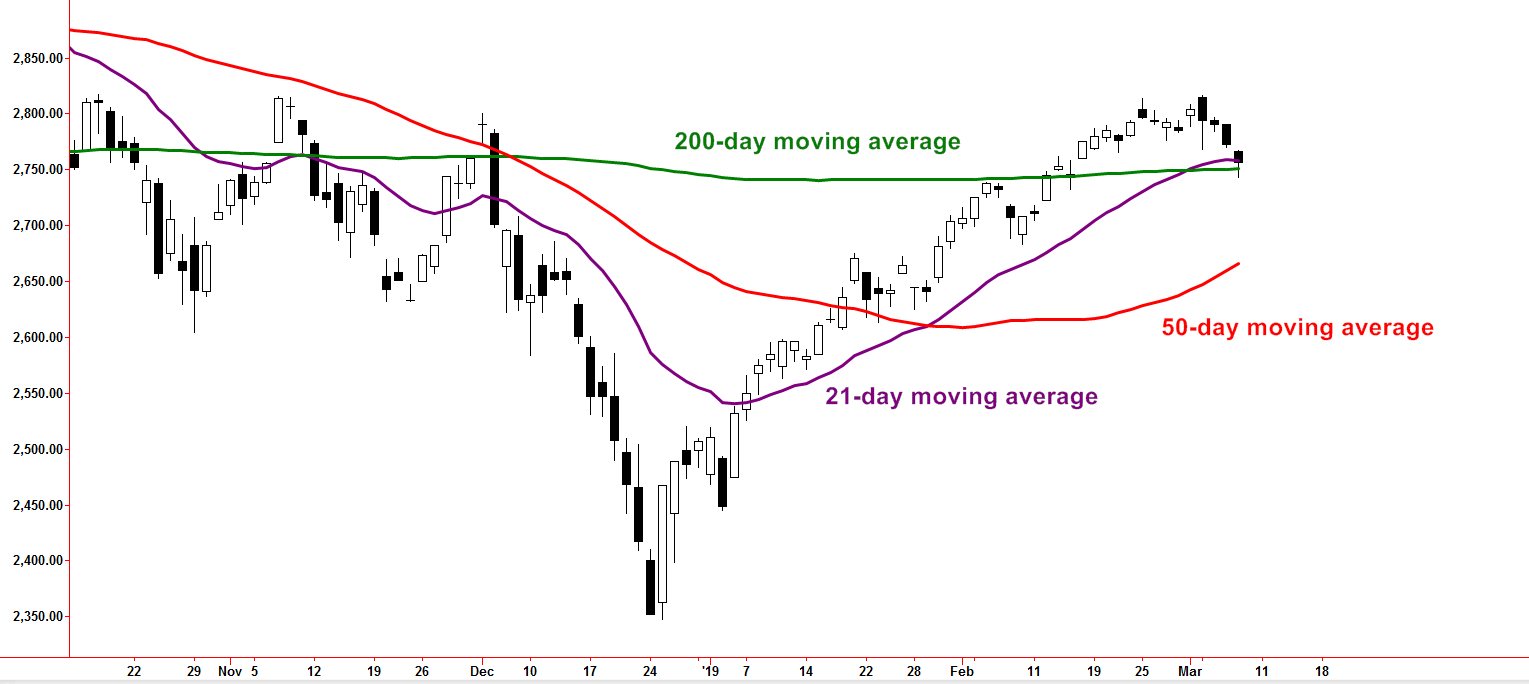
Moving Averages

Moving averages (displayed below) are popular ways to identify trends because chart readers can easily see if the asset is above the moving average or below. If the asset is above the moving average the trend can be defined as an “uptrend”.  If the asset is below, it can be labeled as a downtrend.  The number of days used to calculate the moving average can vary in order to detect trends of various time frames such as shorter-term, intermediate or longer-term.
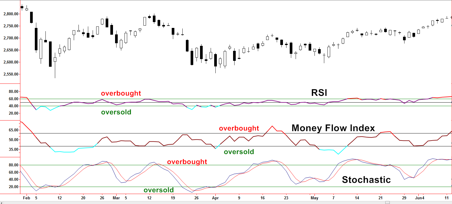
200 day
Created with TradeStation. © TradeStation Technologies, Inc. All rights reserved

Mean Reversion

The “buy low and sell high” concept can also be conveyed through mean reversion methods.  In case that term is new to you, mean reversion simply means the movement is stretched, gone further than it typically does, and may soon snap back.  “Overbought” and “oversold” are common terms associated with mean reversion methods.  If a stock is in a trading range, by definition, it reaches an upper point, or extreme and then goes down toward a mean or average.  It may then overshoot and go to a lower extreme, becoming oversold and then revert back higher.  This process may be repeated numerous times.  Trading ranges may be after an uptrend or downtrend has slowed.  These may lead to a full reversal in overall direction or the trend may eventually resume but at a different slope.  Once a trading range is identified, a portfolio manager must then be able to identify what constitutes the extremes or overbought and oversold zones.  Tools of the trade may include Stochastics, Money Flow Index, and RSI, among others (pictured below).
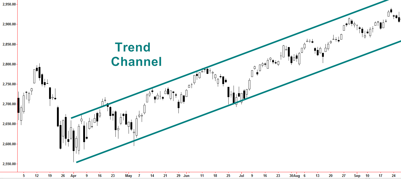
RSI Money Flow
Created with TradeStation. © TradeStation Technologies, Inc. All rights reserved

Volatility Analysis

Tying the states of trending and trading ranges together may also involve volatility analysis.  If volatility is high enough a trend may be observed and at the same time, upper and lower extremes can too.  These are often referred to as trend channels (see below).  Modest adjustments to exposure are often the goal when trend channels are identified such as the adding of positions around the lower channel line or “profit-taking” near the upper channel line. 

Trend Channel
Created with TradeStation. © TradeStation Technologies, Inc. All rights reserved

Why does this matter?

Many investors take a hands-off approach to investing but that puts hard-earned money at the whims of the changing trends, and some bear market trends can be devastating.  Active portfolio management, by way of technical analysis, often includes implementation of the tools discussed above. These tools detect periods of trending or trading ranges.  Refinements with more specific trading tools and methods within those periods can further increase odds of potential success in navigating the unknown waters yet to be seen. This comprehensive approach to investing is used in Spectrum’s management for its clients.

US Dollar Impact on Bonds and Interest Rates

Well known technical analyst and commentator, John Murphy, CMT, authored the groundbreaking book, “Intermarket Technical Analysis”, published in 1991. He covered his research of how stocks, bonds, commodities, and currencies influence each other with varying degrees and various lead and lag times.  Armed with a ruler, a plain white sheet of paper, and a pencil, I was able to make a cross comparison grid that displayed all the asset classes he noted in the book.  Each cross comparison highlighted the direct or indirect influence, the lead, lag or coincident impact, and the typical time in months of that impact.  The US Dollar stood out on the grid because his work found that it had a leading tendency across most of the asset classes with a couple being coincidental while not being a laggard to any.  A couple of years later, in 1994, I met John at a conference.  Like a star struck teenager getting a Taylor Swift autograph, I excitedly had him sign my copy of his book.  I also showed him the grid.  He smiled and said, “perhaps I ought to add something like that to my next revision”.  That made my day.  He also said something extremely important.  He said that he was noticing the intermarket relationships were evolving…

The US Dollar is like the wind blowing through the investment world. It can act as a headwind or a tailwind to most all asset classes.

Sometimes the influence is only slight and other times the gusts can be highly influential and blow an asset sharply off course.  Over the last 25 years, the world has changed significantly.  Technical or chart-based investors focus less on the why and more on the bottom line.  That said the dollar’s role has evolved as relatively new players have entered the scene.  Historically small economies, such as China, have recently taken on greater roles in trade.  Global oil trade in US Dollars has undergone correlation changes as the US has become less dependent on foreign oil.

With what has been covered so far, there are many paths we can walk down in how the US Dollar influences other assets or is impacted by other assets. To rein it in, let’s start with bonds and interest rates.

Created with TradeStation. © TradeStation Technologies, Inc.  All rights reserved.

In our example (chart above), we will use the iShares 20+ Year Treasury Bond ETF (TLT) to represent longer-term bond prices. Keep in mind as bond prices rise, interest rates fall.  As mentioned earlier, the US Dollar is like a wind that generally blows against the direction of bond prices and in the same direction of yields.  At the risk of oversimplifying, rising rates attract dollar denominated investment.  A reason why that risks oversimplification is because investors often take action in anticipation of future events.  Therefore, the US Dollar can lead if domestic economic activity is improving, attracting investors from around the globe to need US dollars for US investments.  As economic activity improves, interest rates rise which can increase demand for dollars.  However, sometimes interest rates are held artificially low as economic activity shows signs of improvement.  I have heard it said that the US Dollar is the stock certificate of the United States.  If people are bullish on America, then they need US Dollars to put their investment plan in action.  So there really is not a consistent starting point but we can recognize the inverse nature of the US Dollar to bond prices.  Don’t be too eager to assign a cause and effect because sometimes demand for the dollar leads and sometimes it is demand for bonds.  Be satisfied in simply knowing a relationship exists.  Arrows on the chart illustrate the concept of inverse directional bias.  The general trend of the TLT has been up during the first three quarters of 2017, while the general trend of the dollar is down.  Trend direction appears to have changed in early September.

So why go through all the trouble? Investors implementing charting techniques may find it easier to analyze the dollar and then draw conclusions about bonds and interest rates.  Traditional chart methods such as breakout/breakdown implications and trend line breaks are much more misleading on charts of the TLT versus the lower volatility trending nature of the US Dollar.  No method is perfect but it only takes a quick look to conclude the price action in the TLT is more volatile than the US Dollar.

It can be very frustrating to learn a new concept and have it appear to not work. Setting expectations is important and in this case, the inverse direction bias of the dollar to bonds should not be assumed as being in rigid lock-step.  In the lower pane of the chart, two measures of correlation are displayed.  If the dollar (UUP) moves in the opposite direction as the bond (TLT), then a blue dot is plotted at -1.0.  Those are the days in which the theme of this blog is easy to embrace.  If the dollar (UUP) moves in the same direction as the bond (TLT), then the blue line is plotted at +1.0.  During 2017, there are many days in which the bond and the dollar moved in the same direction.  For example, those are the days in which a viewer may be tempted to abandon these concepts – abandoning what ultimately could be a useful concept.  A red line can be seen in the lower pane that represents a 21-day average of the 1-day correlation.  Other than in mid-February and mid-July, the rolling 21-day average of correlation fits the norm of being inversely correlated.

If we are comfortable with the idea of inverse correlation but with the understanding it is not precise, then we can take the next step. Instead of focusing on implementation of trend analysis and other charting techniques applied to bonds or interest rates,

applying methods to the less volatile US Dollar could prove useful.

Conclusions derived from chart analysis of the dollar can then be transferred over to bonds (inverse conclusions) or the interest rates (same conclusions).  Actual chart-based methods are vast and beyond the scope of this blog.  The bottom line concept is if bullish conclusions are derived after assessing the dollar then a bullish outlook on interest rates (bearish on bond prices) can be concluded.

Chart-based assessment of the US Dollar should not be the only method but can be a useful tool to investors seeking to diversify analysis techniques within bond and interest rate assessment. Lower relative volatility of the US Dollar may lead investors to insights more difficult to conclude if focusing methods on underlying assets with higher volatility such as long-term interest rates.

Page 1 of 3

Spectrum Financial, Inc 2023