
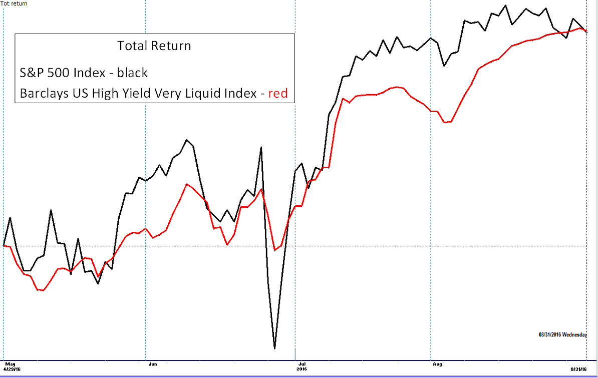
Volatility is one of those words often used to describe the movement of the market or investments. The specific nature of volatility tends to mean different things to different people. Today we will cover a few of these definitions with the goal of using nuances of the definitions to better our understanding of how an investment or index’s movement character presents itself along its future path. Understanding should also increase in regards to how a mutual fund may act based on the volatility characteristics of its holdings. Why look at volatility in the first place? The chart below displays the S&P 500 Index and the Barclays US High Yield Very Liquid Index, both having a nearly identical return for the time frame but took different paths to get there.
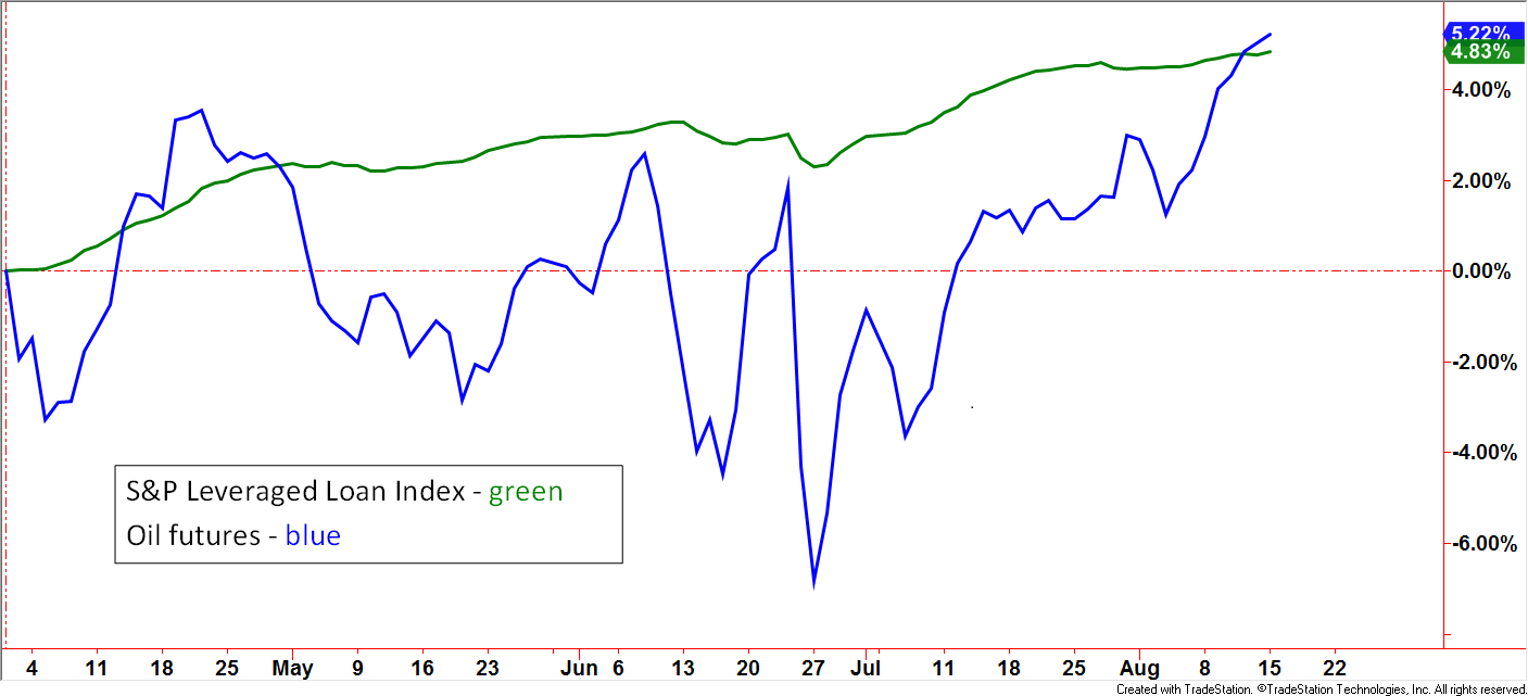
In the next example, oil futures posted a gain of +5.22% while the S&P Leveraged Loan Index posted a gain of +4.83%. During the noted time frame, which one would you have preferred to own? The oil futures had a higher return so would that have been the better investment? Let’s use our imagination – what if these were two mutual funds and we were looking at a financial publication. Without seeing charts or statistics, the one up +5.22% would likely have initially been more intriguing than the one up +4.83% but a deeper dive could have led to different conclusions. Charts like the ones above and below are not readily available. Seeing a list of investment choices, like what are often printed in magazines, newspapers and electronic media, can be very misleading without an understanding of volatility and its impact on how the return was generated and how future returns may be generated.
 Created with TradeStation. © TradeStation Technologies, Inc. All rights reserved.
Let’s circle back around and describe volatility using various financial terms. There are two main lines of assessment: “Relative” and “Absolute”. Relative volatility measures one versus another, commonly seen as an underlying investment versus a benchmark. A popular measure seen in many financial publications is “Beta”. With this example, it is common to see a mutual fund’s Beta versus the S&P 500 Index. A basic definition, or at least the intent, is to gauge the mutual fund’s historical tendency to move “X” times the movement relative to the S&P 500 Index. If a mutual fund’s Beta is 1.4, then the approximate movement should be around 1.4 times that of the S&P 500 Index – up or down. This gauge allows an investor to quickly get a feel of the tendency toward a higher or lower volatility personality. However, potential investors must be careful not to be misled by this statistic. Betas take into account all market conditions within the noted period being described. Be sure to check the period and recognize the market conditions. If the market was in a relatively steady uptrend, then the Beta may understate what may actually occur if the market transitions into another environment. A drop by the underlying investment much more sharply than the Beta implies is often called “Beta expansion”. This is often seen during periods of shock. A recent example would be larger moves than implied by Beta in response to the Brexit vote.
Betas for actively managed mutual funds can also be easily misinterpreted. While fully invested, a fund may have, for example, a Beta of .8 or 80% of the S&P 500 Index listed on its most recent Fact Sheet. If the actively managed mutual fund becomes defensive and drops exposure to 0%, then Beta becomes 0.0 or some other beta reading if partially invested.
Other forms of relative volatility measures exist. Upside and downside capture measures the underlying investment’s historical gain or loss when the benchmark is rising or falling. This statistic usually uses a set period, three years for example, which takes the net return of the benchmark during the months it was higher, and divides by the total return of the underlying investment during the benchmark’s up-months. For example, a mutual fund with an 80% up-capture means it would have made 8% if the benchmark – S&P 500 Index were to have been up 10% in total for all the up-months in the given period. Downside capture works the same way. This concept can be viewed as a more evolved form or more useful form of Beta, as it separates out the different volatility personalities the investment may have during bullish periods as compared to bearish periods. Other forms of relative volatility metrics may be seen that are proprietary to well-known rating services. In the case of mutual funds, returns and statistics are often shown versus custom benchmark categories.
Absolute Volatility
Absolute volatility metrics are independent of benchmarks as they focus solely on the underlying investment. In its most basic form, quarterly returns or other time frames can give an investor a quick perspective on volatility. Standard Deviation is a popular measure that grew out of looking back at periodic returns while attempting to assess how consistent or inconsistent the typical return has been. Risking oversimplification, if over the last three years, the average quarterly return of a mutual fund has been 5%, +/- 3%, the “plus or minus” part is the standard deviation.
Sharpe Ratio
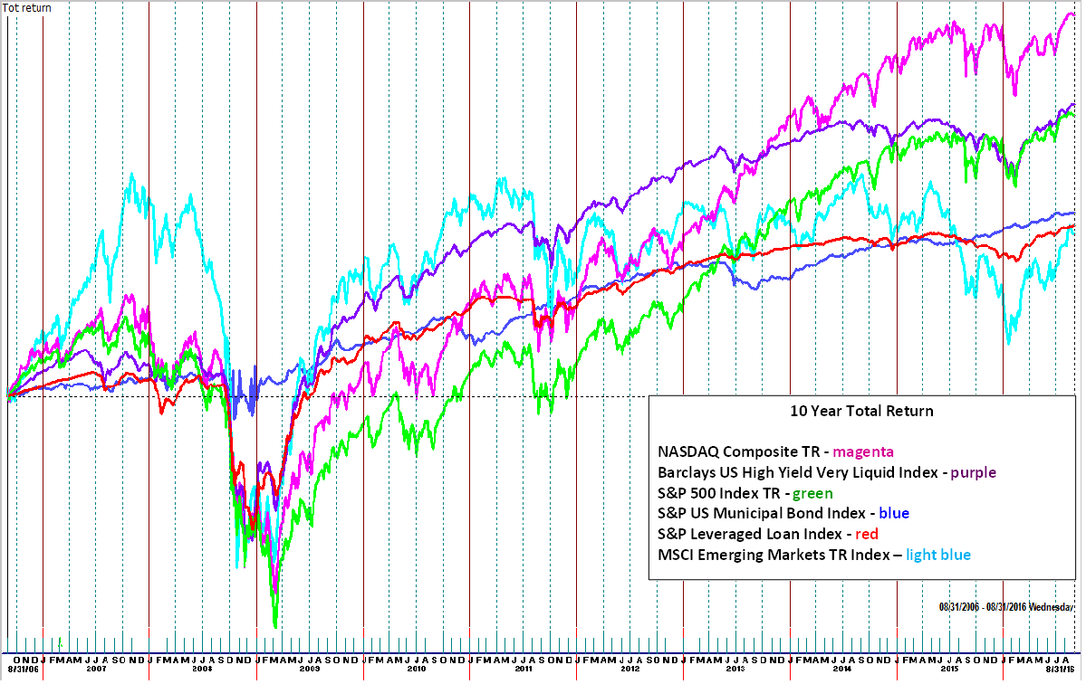
The Sharpe Ratio evolved out of the Standard Deviation metric. In a nutshell, the Sharpe Ratio divides the return of the underlying investment, minus the “risk-free” rate of return (think T-bill), divided by the standard deviation. Now we’re cookin’ with gas! This measure gives investors a tool that combines the investments’ return and how it was achieved relative to its volatility. The Sharpe Ratio falls under the category of Risk Adjusted Return. Another name and acronym is a Volatility Adjusted Return (VAR). I believe the latter is more descriptive. Let’s take it one more step before getting into application. A limitation to standard deviation, which makes its way into the Sharpe Ratio, is that the metric does not discriminate between upside and downside volatility. What if your mutual fund goes up quickly but down slowly? While that would be desirable, its standard deviation and Sharp Ratios could be impaired to some degree. The Ulcer Index instead uses a formula that compares the underlying investment’s return to its drawdown. For those of you who may not know, a drawdown is simply how much is lost during periods of decline/dip before going back up again. That definition makes it more obvious of how the Ulcer Index got its name. The chart below displays a number of indexes for the 10-year period of 8/31/2006-8/31/2016. The magenta line, the NASDAQ Composite Total Return Index was up the most but would it have been the most desirable investment? Perhaps…if you have an iron stomach. Let’s look at these indexes through the lens of the volatility metrics already covered.
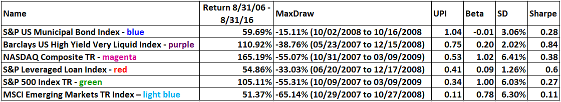
The argument was already made that the Ulcer (Performance) Index (UPI) is a logical way to combine return with the negative of drawdown which is how the list is sorted. The S&P US Municipal Bond Index ranked the highest despite having the fourth highest return.
 Click on Chart to expand
Again, the UPI is telling us if we are being compensated with return with each incremental increase in risk as defined by drawdown. Already noted was that the NASDAQ Composite TR had the highest return but at what cost? With a drawdown of 55.07% was it worth it? It is important to pause here and state that these questions cannot be answered in a black and white manner as most are based on individual investment objectives. Various volatility statistics can help hone the objectives and define characteristics that fit your profile that includes the point in which emotions won’t allow staying in a position. Back to the stats – Look at the Barclays US High Yield Very Liquid Index. It ranked in second place when it came to performance but with a Beta 20% of the S&P 500 Index (all Betas above are vs S&P 500 Index). The Standard Deviation (SD) was one-third that of the S&P 500 Index.
In an earlier blog, we covered some Wall Street Myths. One not included is related to risk/reward. We were all taught that with more risk comes the potential of more reward. If that were true, then wouldn’t the ones with the highest volatility, i.e. standard deviation and Beta, have the greatest returns???
We have all heard, “you are what you eat”. Call me a market nerd but I see its application in investment portfolios, including mutual funds. Portfolio managers, especially active portfolio managers, that incorporate these concepts have increased odds of creating funds with NAV movements that reflect the desired volatility characteristic. The examples in today’s blog have been limited to broad-based indexes and not individual stocks, ETFs, or mutual funds. However, potential holdings can be screened according to these volatility metrics and done so at an even greater depth by assessing how the numbers change or stay similar with various time periods. Portfolio managers can assess current market conditions and reference prior, similar market conditions and have some degree of heightened feel of how certain investments may act.
For advisors in a position of fiduciary responsibility over client assets, volatility assessment adds another layer of suitability due diligence. We have all been there – wide eyed and with an increased pulse, tempted to pick the investments the media highlighted as the best performers that quarter, year, etc. Understanding the paths taken to achieve those returns is a display of investment knowledge maturity.
Disclosures
Barclays US High Yield Very Liquid Index This benchmark includes publicly issued U.S. dollar denominated non-investment grade, fixed-rate taxable corporate bonds that have a remaining maturity of at least one year, regardless of optionality. The bonds are rated high yield (Ba1/BB+/BB+ or below) using the middle rating of Moody’s, S&P, and Fitch, respectively (before July 1, 2005, the lower of Moody’s and S&P was used). Included issues consist of only the three largest bonds from each issuer that has a minimum amount outstanding of $500 million or more (face value) and less than five years from issue date. (Short Name: Barclays High Yield VL Index)
Standard and Poor’s 500 TR Index (S&P500) is a capitalization weighted index of 500 stocks representing all major domestic industry groups and assumes the reinvestment of dividends and capital gains. It is not possible to directly invest in any index.
S&P/LSTA U.S. Leveraged Loan 100 Index: This benchmark is designed to reflect the performance of the largest facilities in the U.S. dollar leveraged loan market. Term loans from syndicated credits must meet the following criteria at issuance to be eligible for inclusion. 1) senior secured 2) minimum initial term of one year 3) minimum initial spread of LIBOR +125 basis points 4) U.S. dollar denominated 5) all constituents must have a publicly assigned CUSIP (Short Name: S&P Leveraged Loan Index)
SAPIMAIN: The S&P U.S. Municipal Bond Index is a broad, market value-weighted index that seeks to measure the performance of the U.S. municipal bond market.
NASDAQ Composite Index is a broad-based capitalization-weighted index of stocks in all three NASDAQ tiers: Global Select, Global Market, and Capital Market.
MSCI Emerging Markets Index is a capitalization weighted index that is designed to measure the equity market performance of emerging markets.
This writing is for informational purposes only and does not constitute an offer to sell, a solicitation to buy, or a recommendation regarding any securities transaction, or as an offer to provide advisory or other services by Spectrum Financial, Inc. in any jurisdiction in which such offer, solicitation, purchase or sale would be unlawful under the securities laws of such jurisdiction. The information contained in this writing should not be construed as financial or investment advice on any subject matter. Spectrum Financial, Inc. expressly disclaims all liability in respect to actions taken based on any or all of the information on this writing. For full disclosure please see disclosures page here.